Atlantic Yards/Pacific Park Report, August 2017 – Present
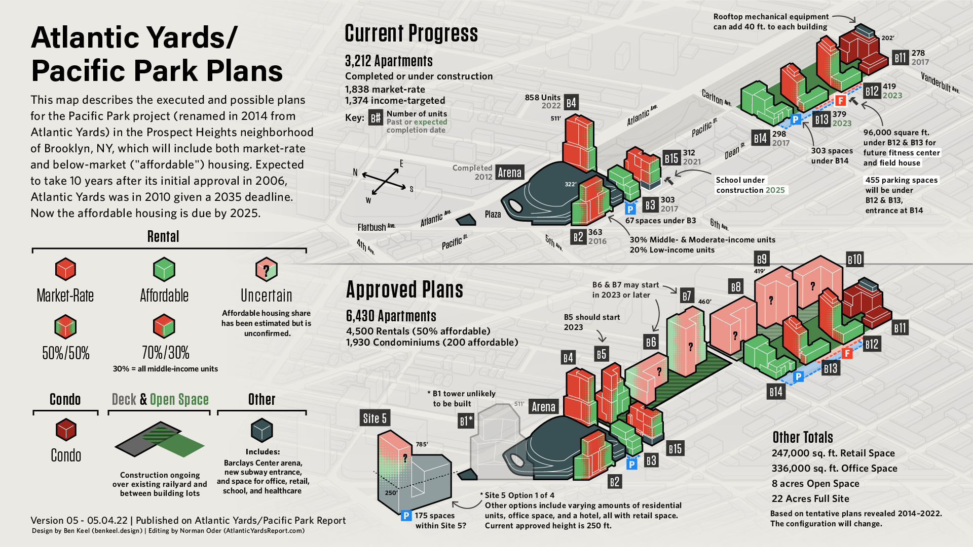
This living infographic is an ongoing collaboration between myself and Norman Oder, watch dog journalist and New York City tour guide. It summarizes the present status and future of the Pacific Park mega-development, which aims to bring 4,500 rental units to the Prospect Heights neighborhood of Brooklyn. 2,250 of those units are to be priced at below-market rates.
Norman summarizes the project this way on his site, where he has reported on the project at a daily pace since 2005:
“Atlantic Yards/Pacific Park is complicated, and it’s changed a lot. Four of 15 (or 16) towers have been built (plus the Barclays Center). Four are under construction.
That’s rather slow progress for a project announced in 2003, approved in 2006, and re-approved in 2009, though momentum is increasing, given that the under-construction towers should deliver 1,969 total apartments, 30% of them income-restricted, or ‘affordable.’”
The project aims to be done by 2035. However, all the below-market units are to be completed by 2025, else the project developer faces monthly fines until completion.
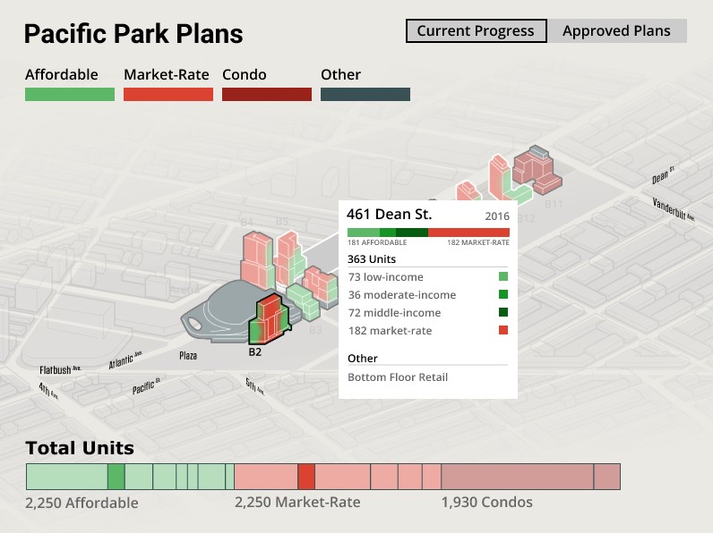
Interactive Graphic: Unit Types and Counts per Building
Importantly, those below-market, income-linked units are not all the same. The current majority are allocated for residents who earn the same as or above the region’s median income. This interactive version of the graphic below illustrates how many of each unit type there is, where and when they are built, and what is still to come. It’s designed to fit directly inline with Norman’s blog and made with a combination of Adobe Illustrator and D3.js.
By selectively revealing info by a user’s mouseover and in different layers, I’m able to feature the essential points of Norman’s story while preserving a clean graphic. Automatically generating the graphs and building fills also allows us to update the information by simply editing a spreadsheet.
Infographic Process
Our partnership started when I consulted him on the strategy of my undergrad senior capstone project. At that point, the best illustration I could find of the below-market units to come was a 2014 graphic from the developer of the project, Greenland Forest City Partners (below). It’s informative and accurate, but lacks context of the neighboring blocks and is hard to quickly analyze.
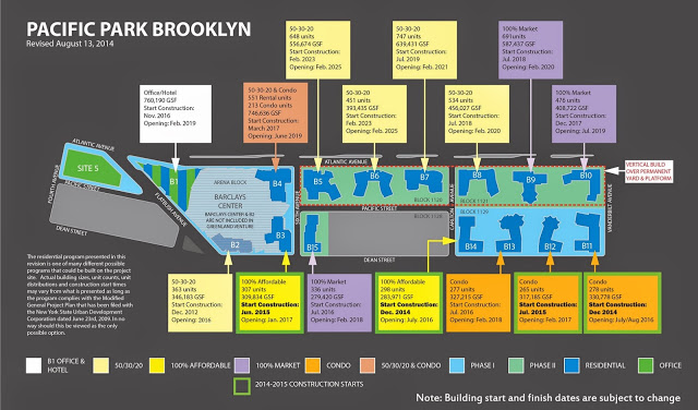
August 2015 map prepared and distributed by Greenland Forest City Partners
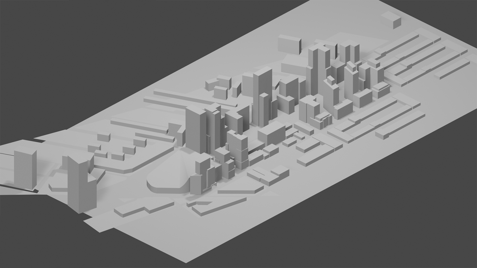
In order to provide the information in the 2014 map with the 3D context of renderings with a recognizable and accurate view, I decided to model the project myself. After sketching out the buildings from all angles using any available renderings or diagrams, I made a simplified model of the buildings and neighborhood in SketchUp, and then traced and filled in the buildings in Adobe Illustrator. Norman provided editing oversight, verifying the content of the graphic and portrayal of the project. He published the initial version below on his blog in August 2017. The original isometric graphic was developed over the course of three months, with about 2 months of part-time editing work between Norman and myself.
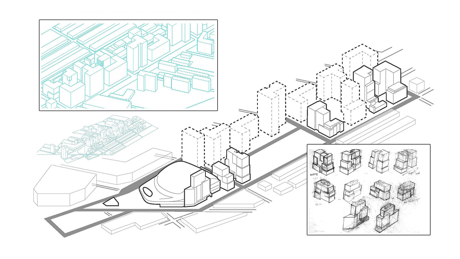
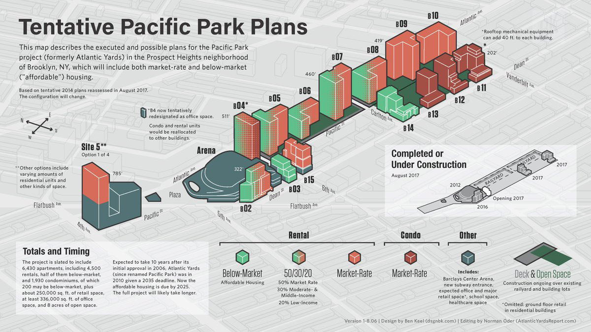
Since no official project view exists from this isometric angle, I have to keep up my own records and model for the graphic. The model has been since imported to Blender, my 3D platform of choice. I keep it updated with current building designs and heights and verify it against new renderings, then check the graphic against it on an annual basis.
Interactive Graphic Process
The interactive graphic process started in May 2022, when consulted other visual journalists and taught myself D3 through Ritchie King’s Visual Storytelling with D3 book. At the same time, I sketched out different iterations of the interactive and made a prototype in Figma.
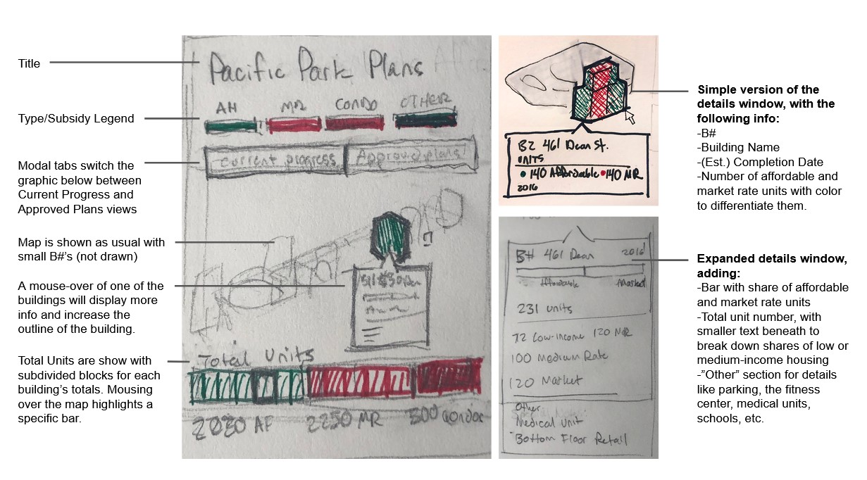
The design and the process of converting my Illustrator file to a interactive SVG took about 1 month of part-time work in June 2022, but I wasn’t able to pick it up again until the Fall because of my wedding and school. Fortunately I was able to incorporate it into my final Javascript class project, and a functional prototype was complete after about 60 hours of development work that December. Editing has taken around a month total of part-time collaboration with Norman.
Modularity
With the base map and all the buildings illustrated, the layout can quickly be fitted to different purposes. The graphic can be repurposed to emphasize a different point, report different kinds of content, or share the content in a new medium.
The best example is our “Atlantic Yards/Pacific Park Ownership & Design” graphic. This map takes the “Current Progress” portion of the “Atlantic Yards/Pacific Park Plans” version above and, instead of labeling market rate or affordable housing, illustrates the story of the project’s changing ownership and developers. It uses the same halftone pattern to show shares of ownership between developers like Greenland USA, Forest City, and sometimes the Brodsky Organization. The Arena, currently operated by J. Tsai Sports, is a rusty brown to connect with the color of its facade.
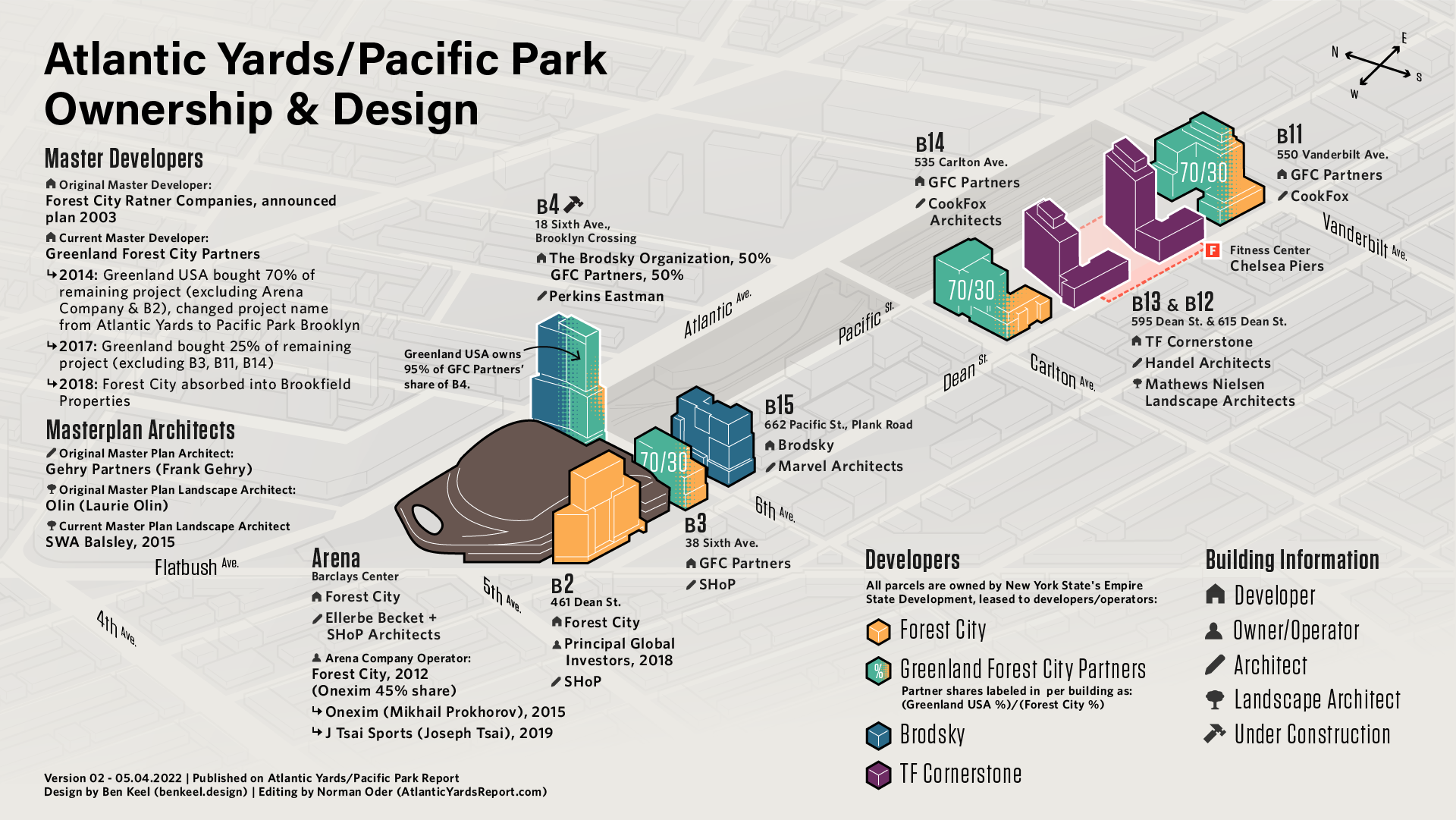
Since the colors are reference specific developers, their brand colors were referenced when possible. Greenland and Forest City were altered for appropriate contrast and color-blind accessibility.

Tools Used:
- Adobe Illustrator for all static graphics
- Blender for 3D compositing and basis for static graphic
- Figma and paper prototyping for design and concept-level collaboration
- D3.JS, CSS, HTML for interactive graphic development