Project at the University of Pennsylvania, Spring 2023
By Myself, Myron Banez, and Kendra Hills. Supervised by Michael Fichman and Matt Harris
In support of Assistant Deputy Commissioner Kathy Matheson, Senior GIS Specialist Andrew Newell, and Commissioner Adam Thiel of the Philadelphia Fire Department
Visit the forecast site, shown in the case study below.
Visit the data analysis page for this project and read the R Markdown Report for in-depth research notes, data analysis, and R code chunks.
The Problem to Address
As it stands, the PFD has limited knowledge about what happens after their job is complete. There is no programmed set of economic development interventions that are used by public agencies in Philadelphia as a response to fire. As such, the PFD wants to better understand and predict consequences of a fire so that they or their partners can promote quick and equitable recovery.
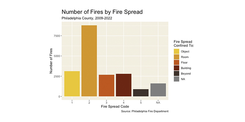
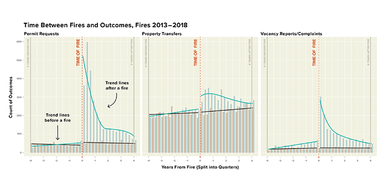
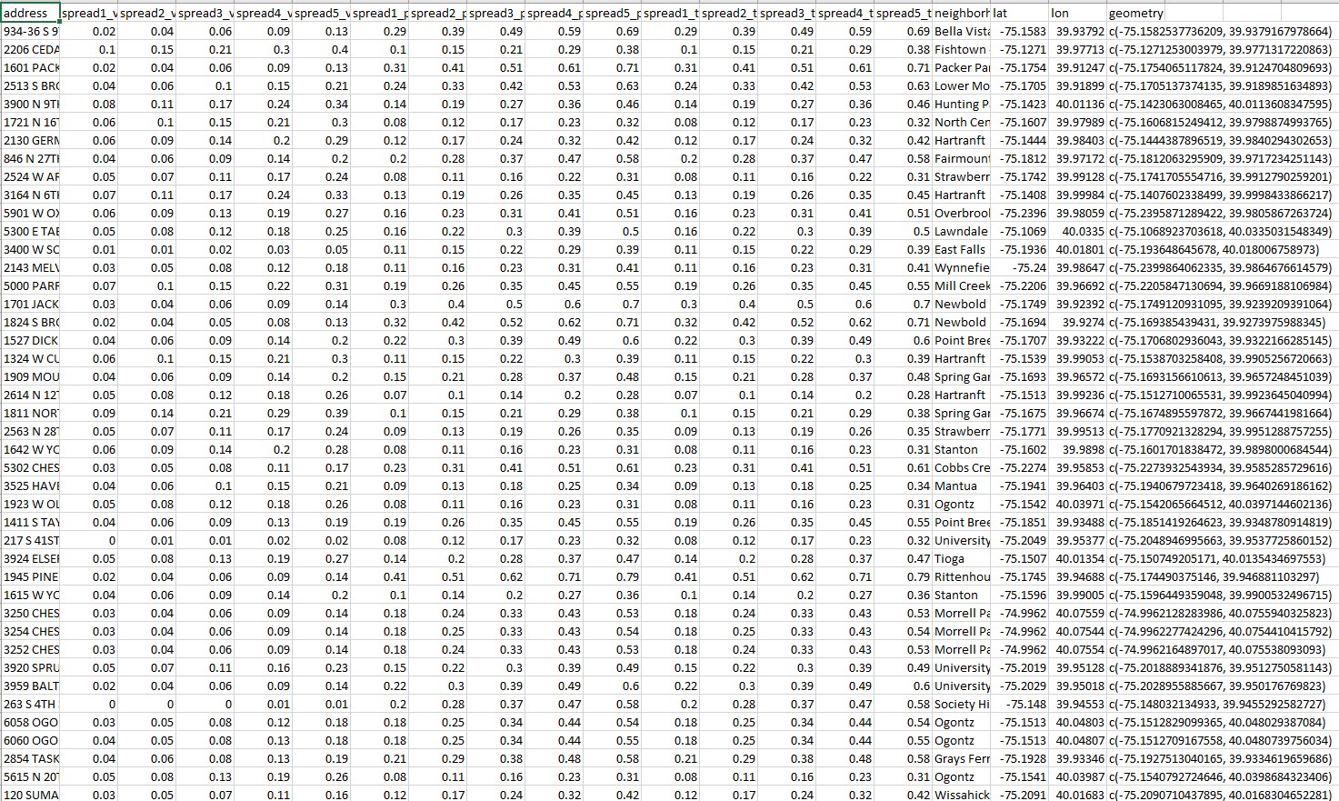
Our group analyzed the incident fire data provided by the fire department to examine any trends and found a usable variable for fire severity. I also examined a combined panel of fire incidents, vacancy reports, construction permit requests, and property sales with a propensity-matched sample set of houses and established an association between fires and each outcome. My partners then created a model for most residences, and predicted the likelihood for each of our three outcomes across different levels of severity. This collection of predictions, if proven accurate and generalizable, gives the Fire Department actionable data to aid in whatever policy or interventions they and their partners want to enact.
However, they need a way to easily access these predictions and examine the patterns across space for themselves. More over, we needed to provide narrative examples of these different outcomes in order to verify our findings.
App Use Cases
My app delivers all our model’s predictions in a simple interface and helpfully frames the data with a case study and researched policy recommendations. These features address the Fire Department’s problem by:
- Advising their estimation of what will happen after a fire happens at a specific residence. With the recovery prediction of a specific residence, they are better informed about how the resident could be assisted.
- Using maps and case studies to illustrate broad trends in fire recovery across Philadelphia’s neighborhoods. This information helps the PFD and their partners target specific groups or neighborhoods for proactive and reactive policies that help steer fire recovery.
App Features
Case Study, Perspectives, and Recommendations
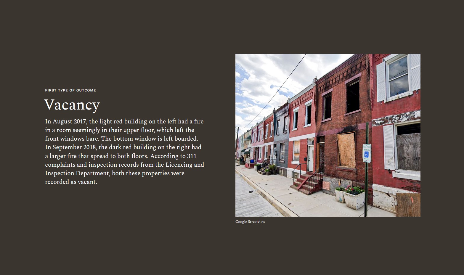
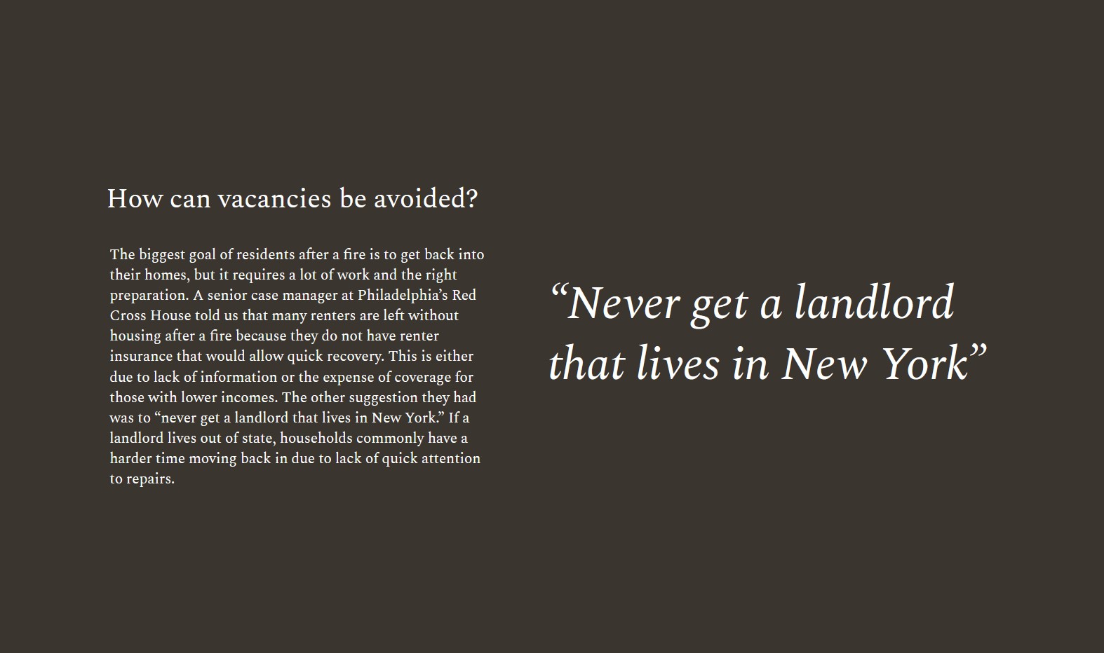
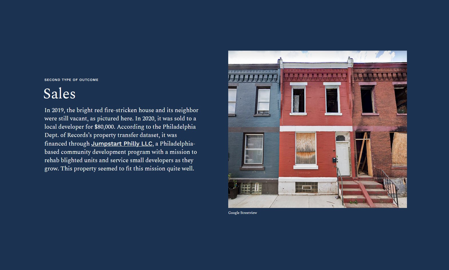
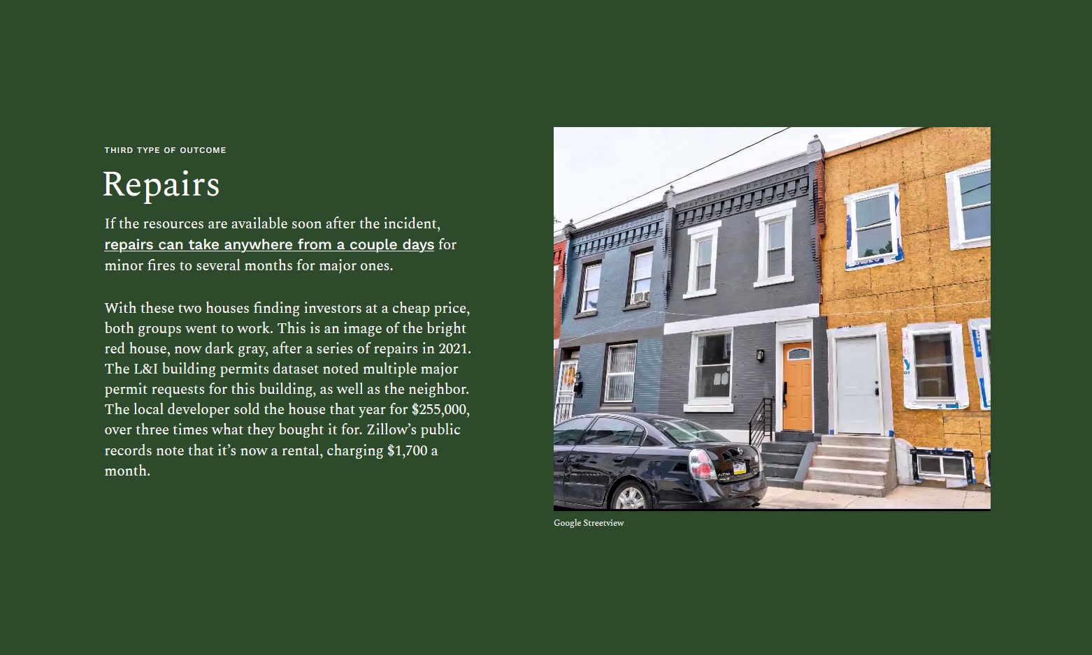
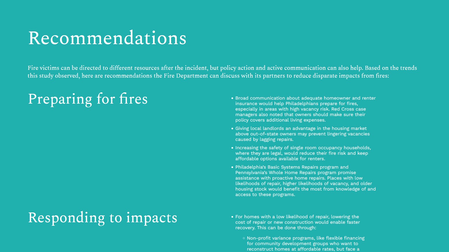
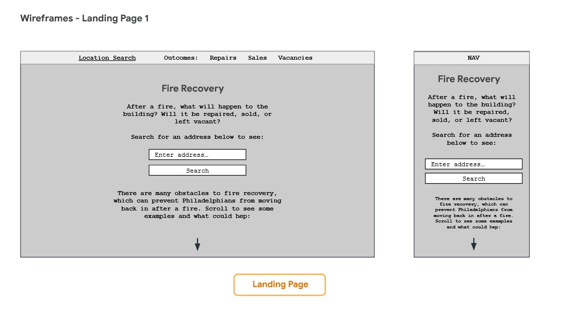
Below the app’s landing page is a scrolling story for a pair of homes in Brewerytown, Philadelphia. Their records after their 2017 and 2018 fires offer insight to all three outcomes: vacancy, sales, and repairs. Between each outcome, we tie in perspective from senior case managers at the Red Cross House who have served many victims of structure fires.
We then use these stories and perspectives to recommend specific policies that would counter the lack of insurance, the city’s aging housing conditions, and other obstacles to recovery.
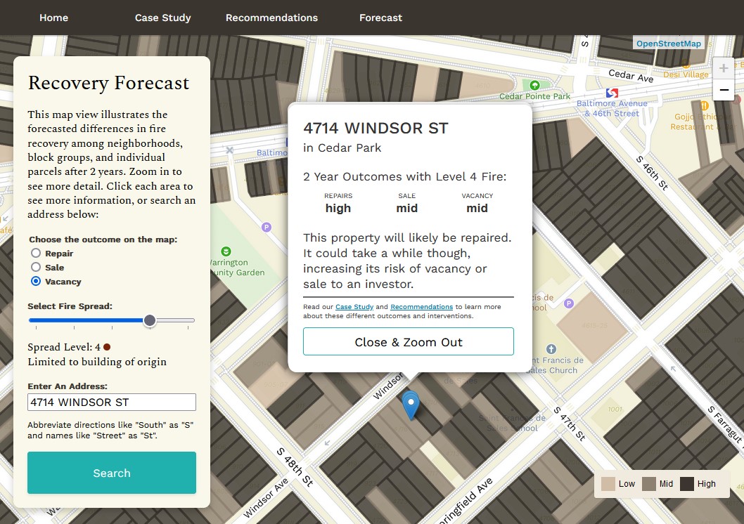
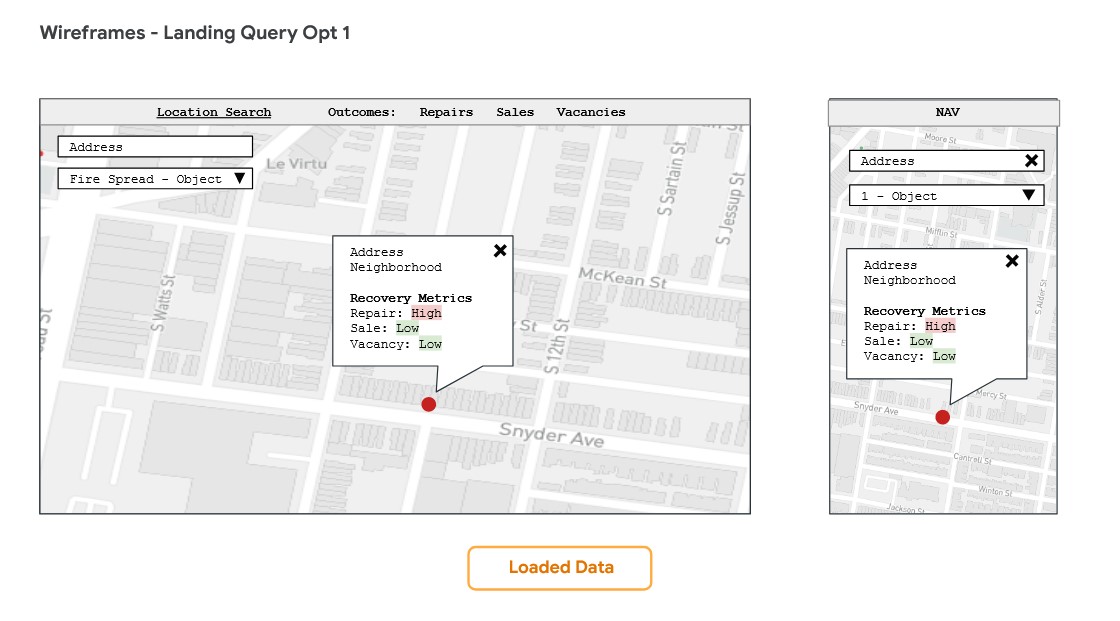
Forecast Page
Our forecast page allows the Fire Department can easily access our predictions according to their use case. The page loads our broad overview of Philadelphia County, summarized by neighborhood.
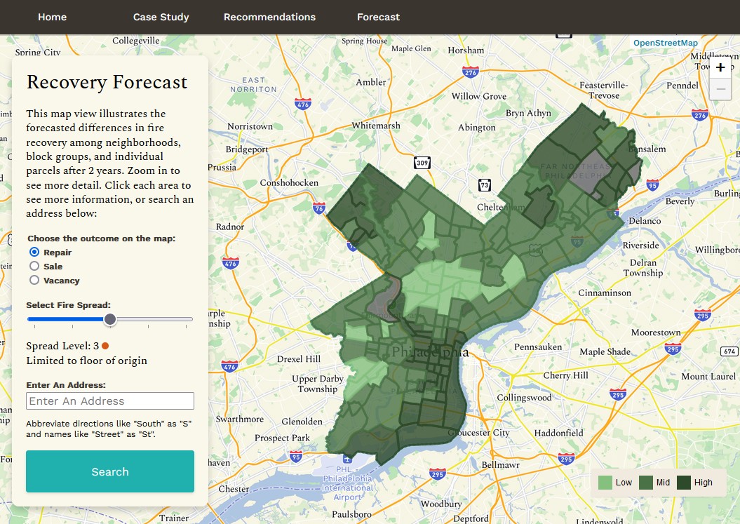
Zooming in splits these areas further into block groups, then even further into parcels.
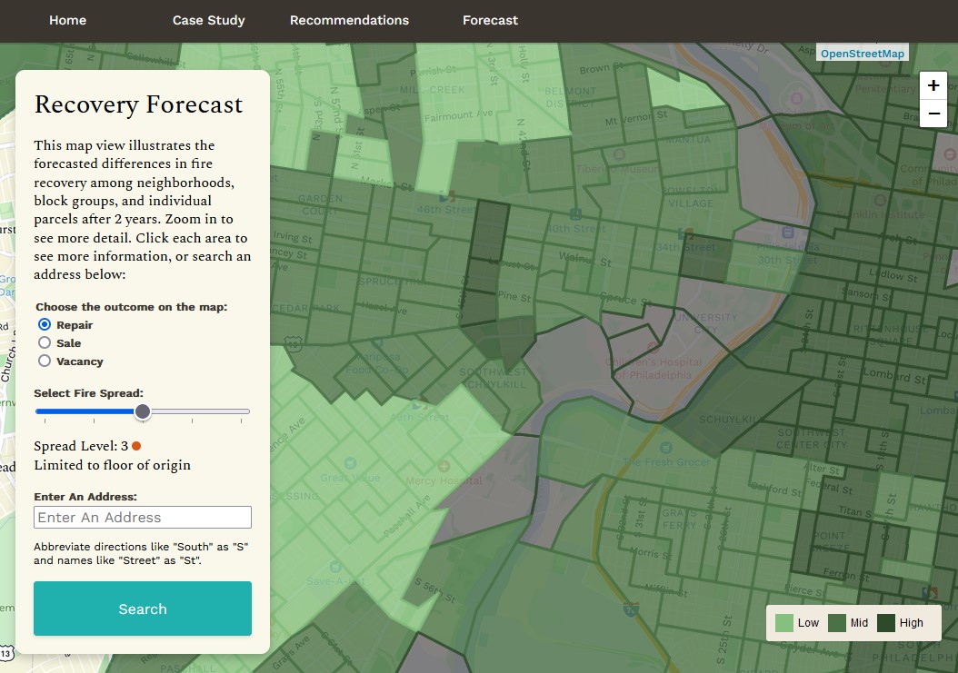
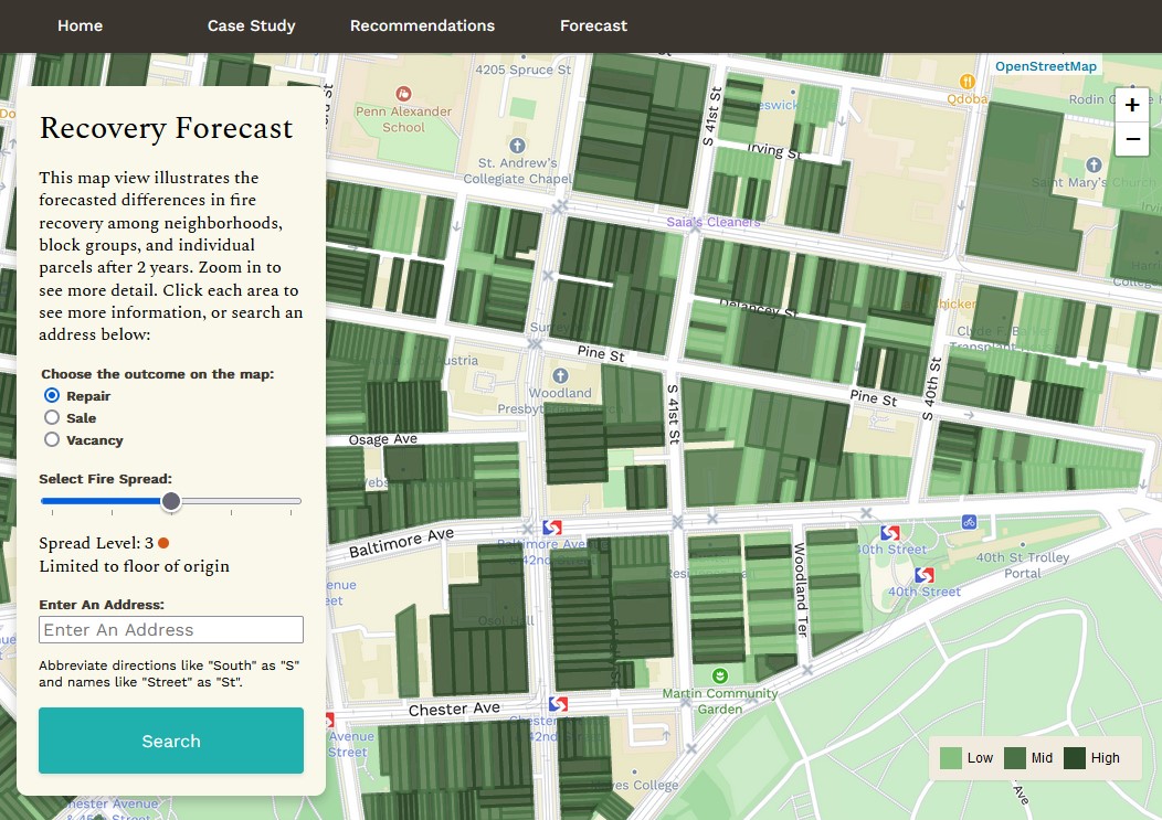
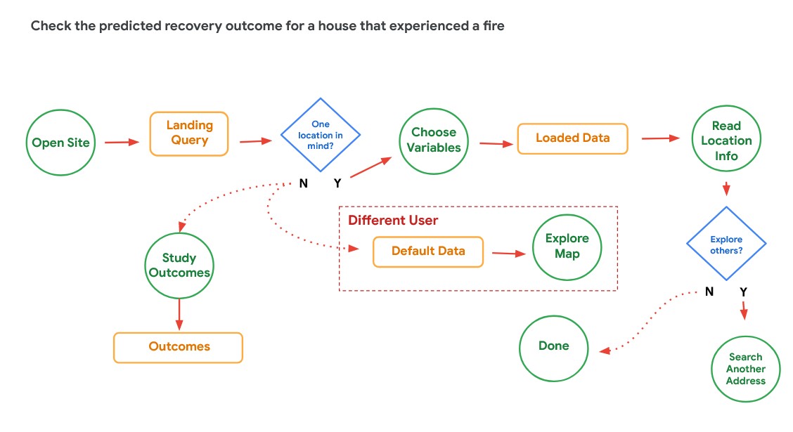
The control panel on the left allows users to change what outcome is shown and control for how severe the fire is that the model uses for predictions.
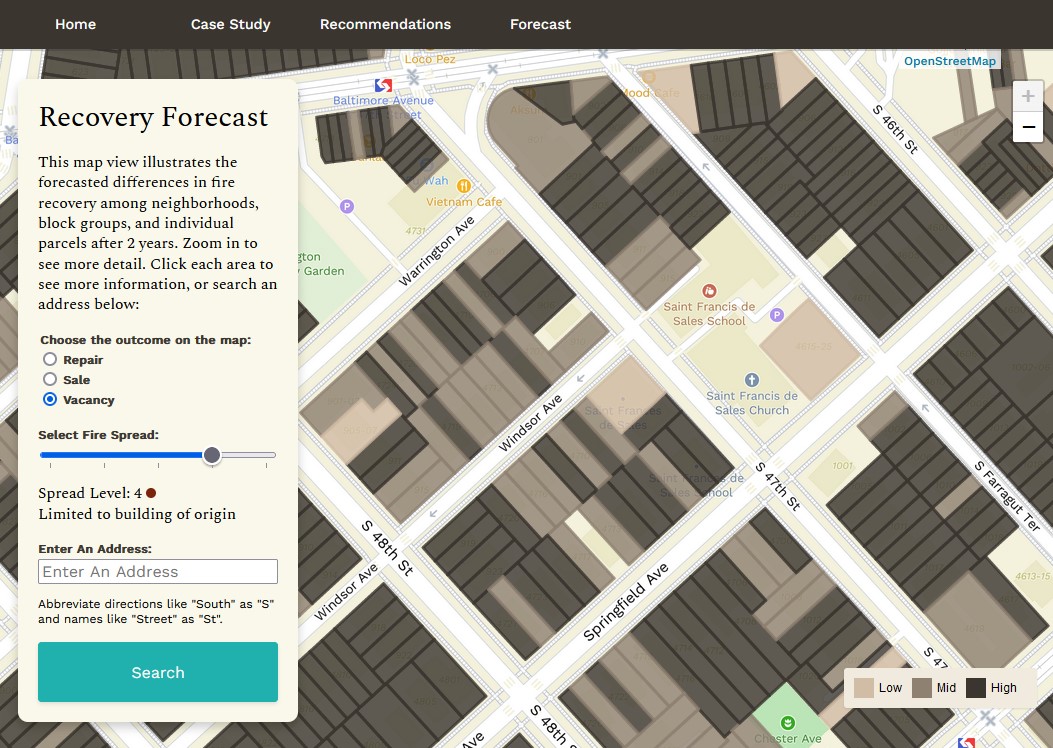
If the user is looking for a single property, then they can search by its street address. We did have to remove many addresses from the data we sampled in order to make consistent predictions, and if the user types one of those in, they receive a custom warning.
Development
The app was completed over the course of five weeks of part-time work. The following sections describe those steps in detail:
User Experience & Visual Design
We arrived at this direction for the app after a week of considering the user experience and what would serve the PFD’s needs the most. Though our scope demanded that we provide predictions for each residence in Philly, along with narrative examples, our conversations with the Fire Department revealed that the forecast would serve different kinds of users: those looking for a specific address after a fire happened, and those looking for overall trends across space. Both would be supported by the narrative case study and perspectives.
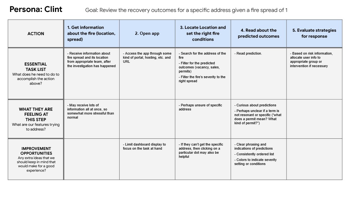
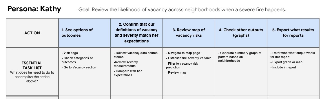
I outlined the user journey, and our team chose to focus our app on the user who needs a prediction for a single address, as that would be most useful for helping individual citizens. I then diagramed the user flow and made quick wireframes that would be very achievable within our deadline.
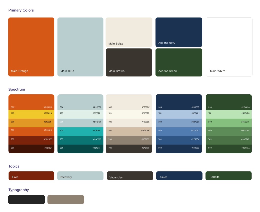
We then refined our visual language to connect the analysis graphs and maps, the app’s case study, and the app’s forecast visualizations. Each color is tied to a particular theme:
Each of these steps established a firm foundation for the design and use case of the app, saving time later on in the process.
Scrollytelling
Development for the forecast page and the case study/recommendations page each took about a week for me to complete. I used the scrollama library and examples to create the fixed image, scrolling text effect. The background changes colors to emphasize the nature of the outcome and tie the case study design to the forecast visualization’s legend.
![]()
Forecast: Search Functionality
In order to make a stable version of the app that could persist on a Github page without major expenses or upkeep, we needed to host all our data in the same repository. However, our single prediction set exceeded Github’s file size limits. I worked around this limit and reduced the initial data load by breaking up the data into 154 neighborhood files (joining OPA point data with azavea’s neighborhood boundaries), then creating one single address list that keyed each residence in our prediction set to its neighborhood file. This change meant that the browser only loads this initial 13MB key file, then grabs whatever neighborhood file it needs based on the search. As a result, the website has smaller data demands, and everything can fit into the single, stable repository.
Forecast: Vector Tiles
Myron and I then added on the neighborhood, block group, and parcel visualization with another week of development. The parcel data was nearly 450MB in total with no easy way to divide, so I used a pipeline structure outlined by my professor Mjumbe Poe to create vector tiles from our data. The process involved the following steps and tools:
- Data wrangling to summarize predictions by neighborhood (azavea) and block group (census), and convert individual residence point data (OPA data) to parcels (PWD data) by address.
- Creating a dockerfile and script to run on Google Cloud Run for the sake of creating the vector tile set.
- Running those scripts and storing the data on Cloud Storage.
- Accessing and styling the tiles using Leaflet’s Vector Grid plugin.
Tools Used:
- HTML, CSS, Javascript for site building and scrollytelling.
- Leaflet JS for map functionality and Leaflet Vector Grid plugin for vector tile functionality
- Google Cloud Services for vector tile creation and hosting
- Mapbox Studio for base map styling
- Figma for app prototyping and user experience design
- Adobe Photoshop for photo editing
- R for data wrangling, csv exports, and original modeling